
Mert Ceylan
Work & Research
Behavioral & Consumer Research
- Consumer Behaviour Research on Rainbow Washing (Q-Methodology)
- Process Tracing: Response dynamics with mouse tracking
- Fintech in Consumer Finance
Business Analytics & Optimization
- Cost optimization and supplier selection using machine learning
- M.Sc. Thesis
-
Visual Data Analytics
Built Environment & Urban Studies (Earlier Work)
Hobbies and Personal Interests
CV
You can reach me at m.ceylanmert@gmail.com
or connect via linkedin.com/in/ceylanmert.
mert mərd मर्त মরদ mêr մարդ βροτός مَرْد mertä
Visual Data Analytics
Academic
Course Report
Dr. Johannes Kehrer
Winter 2024
Technisches Universität München
Software: Tableau, ParaView


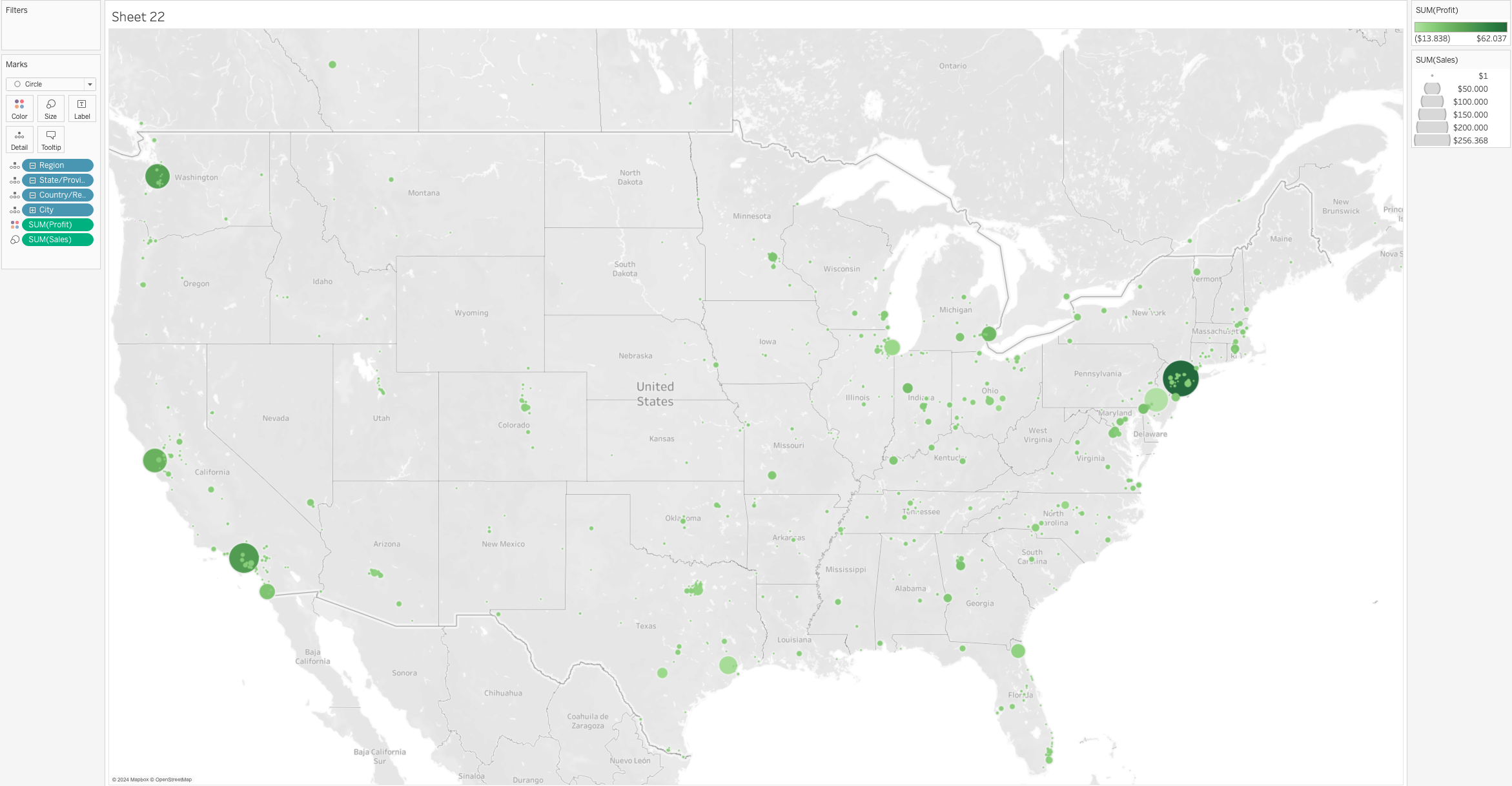
I have placed Profit as color (green) and Sales as the size of the circles. In order to be able to get a city level data, I have placed City under the marks. Finally, with the implementations this visualization returns the correlation between sales and profit across different cities in all US States.
The visualization can be interpreted as such: the trend is that generally the bigger the circle is, the darker the color gets, which means that wherever the Sales are higher, profit values are tend to be higher too. This is a linear trend. Another key point the visualization can be interpreted is that most of the sales as well as profit values are centered around the metropolitan areas, such as New York City and Los Angeles. They are represented with bigger circles, as well as darker green color.